In my last post I talked about the repairs needed to keep the Pattullo Bridge open until a new replacement bridge is built. Now I want to point out my favourite design feature of the existing bridge in the hope that the architects and engineers of the new bridge will keep this one feature.
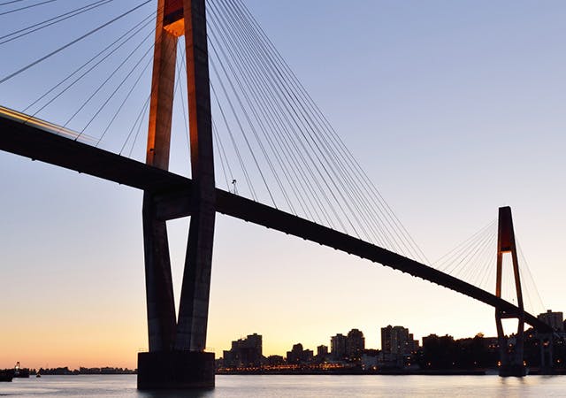
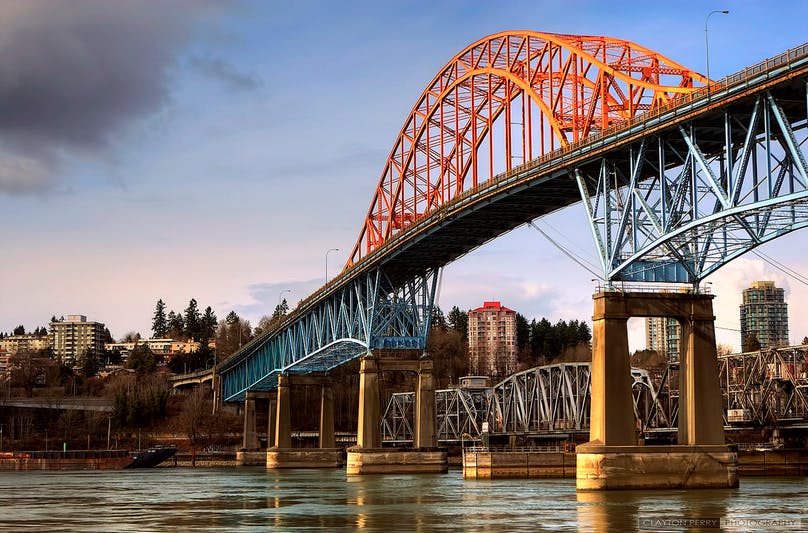
The feature is the “Bell Shaped Curve” displayed in the orange-coloured iron structures on the sides of the bridge at its crest, or basically the centre part of the Bridge. You get a great view of this when you are on the Skytrain crossing the Fraser River between New Westminster and Surrey.
The Bell Curve has special significance for me because of my formal training in statistics. If you read my monthly newsletter you will have noticed that I often discuss benchmark prices in the residential market, and other average prices. So, what’s this got to do with a bell shaped curve? Quite a lot, actually. You see the Bell Curve is really a graphical representation of data. In Real Estate, the data can be residential prices. When you have a high number of price values they may show up in a Bell Curve. If you imagine a vertical line dividing the Bell in half, that would be the average price of the values on the left and right sides of the Curve. This average is also called the Mean. You can see the curve is symmetrical on both sides of the line dividing it in half. The values under the top of the curve are negative on the left side and positive on the right side, therefore creating the mean average in the middle.
The Bell Curve is considered a beautiful thing in pure mathematics. It applies to lots of different kinds of groupings in society and in nature. It shows up when you have lots of data in the thing you are studying. One of the really interesting things about it is that in every Bell Curve most of the data falls under the highest (central) part of the Curve. Then the next largest grouping falls under the next lower part, so that each successive smaller part causes the curve to get closer and closer to its lowest point. Each of these symmetrical groupings around the mean average is called the standard deviation from the mean.
In statistics, another name for the bell shape is Normal Distribution. Here is the more precise thing about that interesting data pattern called the standard deviation. In a normal distribution, approximately 68% of values are always within the first standard deviation from the mean; then within two standard deviations from the mean there are always about 95% of the values. and about 99.7% are within three standard deviations.
In a Real Estate market, the standard deviation could be a group of housing prices on either side of the average price. When the standard deviation is a short distance from the average price (centre line), the bell shape is higher and more pointed at the top. When the standard deviation is longer, it is a lower bell shape like the Pattullo Bridge’s curve. So you can understand now how the number of values that we have in the data can affect whether the Bell Shape is high or low.
Now take a look at a closer look at the Pattullo Bridge’s Bell Curve iron works. Look carefully at the tail end on the outer curve. The inner curve attaches more or less straight down onto the bridge, but the outer curve extends in a horizontal manner which gets very close but does not actually meet the flat part of the bridge (actually, it’s fastened to the bridge for practical purposes, but you get the idea). That’s the area that get’s very close but never quite meets the bottom. This is the tail end of the curve that extends to account for the tiny percentage of data beyond the 97.3 per cent in the third standard deviation. It’s under that small space where “outliers” are located. As the standard deviations get farther from the mean average, we approach the outliers in the tails of the curve. It’s in those tails that I am always looking for special real estate deals.
So please, keep the Pattullo’s Bell Shaped Curve in the new replacement bridge scheduled to be ready in 2023. It has a great deal of symbolic significance in Canada’s fastest growing residential market.
Thanks for reading!
Sibo Zhang, REALTOR®
image via www.translink.ca